
We just completed the second cohort of the Data Catalyst Program, a joint initiative with Dasra and Goalkeep. The program consists of two in-person workshops three months apart, during which each participating organization works towards specific goals. Ten organizations participated in this year’s cohort, each having a mentor assigned from Goalkeep or from Project Tech4Dev, with the mentors meeting their org at least twice a month between the two workshops.
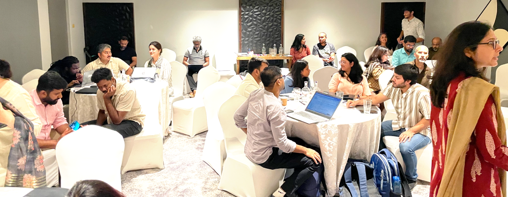
Our first workshop was held in Mumbai in September, with sessions by Goalkeep, Dasra and Tech4Dev. The second one was held in Bangalore and I’m going to describe the first half of the first day to provide an idea of what we do.
After a welcome with reintroductions by everyone in the room, Abhishek went over the schedule for the two days: 9pm – 5pm with breaks for tea and lunch, mostly sessions by a presenter but also some work time between participants and their mentors. There was much excitement because we were handing out a FAT GRANT and everyone was tweaking their pitch decks for day 2.
The three Ls
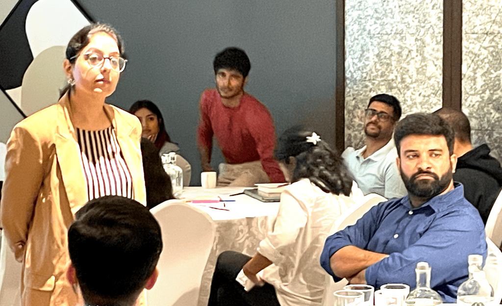
Kavneet from Dasra began with a “reflection” exercise, where she went around the room and asked everybody to share their “three Ls”: what they Liked about the program, what they Learnt from it, and what they are now Longing to put into practice.
Prasad, Fortify Health: “I liked the continuous engagement between the two workshops”
Rukhmini, Saturday Art Class: “This gave us an opportunity to reflect on our program and the work that we’re doing”
Daneshwar, Digital Green: “I learnt about new AI tools, visualization and storytelling”
Prasanna, Caring with Colour: “We deconstructed and then reconstructed our entire approach”
Data Leadership
Next she moved into the Data Leadership session. She started by asking the audience which of them identified as Data Leaders. People hesitated, unsure how to answer. “What is a Data Leader?” some asked. Whatever you think it is, Kavneet answered. Eventually we had three groups, a group who answered Yes, a group who answered No, and then the Undecided.
The Data Leaders were asked why they identified that way, and what their definition was which made them answer Yes. They said that Data Leaders
– Define a vision for data use in their organization
– Foster a culture of data-driven exploration among their peers
– Inspire others to experiment and fail
– Empower people outside the data team to take decisions based on data
The No group agreed that these are what Data Leaders should do, but they did not identify that way because
– The strategy teams and decision makers in their organization don’t use data
– Their roles don’t allow for leadership
BUT they all wanted to be data leaders, and wanted to grow in that direction. Kavneet then responded with a powerful line, which is that “It is a myth that leaders only exist at the top of their organizations”. I noticed a few eyes lighting up and heads nodding at this statement.
[Aside: At the end of this exercise the Undecided group declared that they were Data Leaders :D]
The Five Pillars
Strategy
Prasad, Fortify Health: “Our strategy was to drive our vision within our constraints, identifying gaps as well as opportunities”
Change Management
Akshata, Antarang: “One change we drove was moving from handling our data across Google Sheets and Salesforce to adopting Dalgo as our data platform”
Decisions
Vineet, Dream a Dream: “A major decision we took was moving from Google Sheets and Access to AirTable”
Collaboration
Shaheeda, Antarang: “The data and program teams now have fortnightly meetings to collaborate on dashboarding”
Leadership
Pravin, Farmers for Forests: “We empowered other teams to adopt new tools”
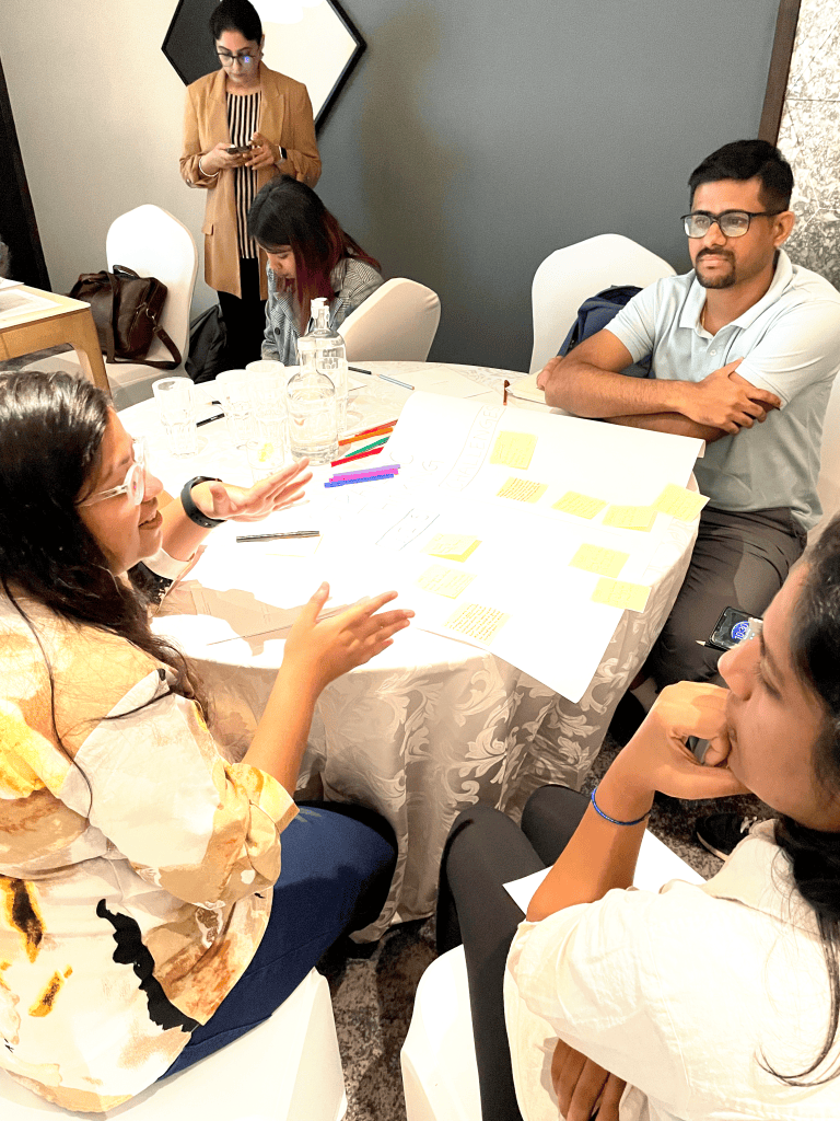
The session closed with participants listing their own examples on Post-It notes and sticking them on large sheets of chart paper, one for each Pillar. We did a similar exercise during the first workshop where we stuck the chart paper on the walls around the room for maximum visibility… but this hotel wouldn’t let us do that. This took away from the impact (just a bit) but we did notice that the pillars with the most examples were Collaboration and Change Management.
Dashboards with Optimized Tables
The second session of the morning was by Jishnu from Goalkeep. Starting with the premise that two widespread problems with visualization dashboards are slow loading times and high running costs, he posited that these could effectively be addressed through better (smarter!) table design. He first defined the three layers of a data transformation pipeline:
- Staging (raw data, maybe with some columns dropped or fixed data types but not other changes)
- Intermediate (where all the work happens)
- Fact (the tables which are exposed to the visualization tools)
The rest of his session was on how to design the “right” Fact tables. Design starts with the final dashboard from which you work backwards to arrive at the underlying fact table. He told us that we need to identify our metrics, our dimensions, and our column-combinations which yield unique identifiers for every row.

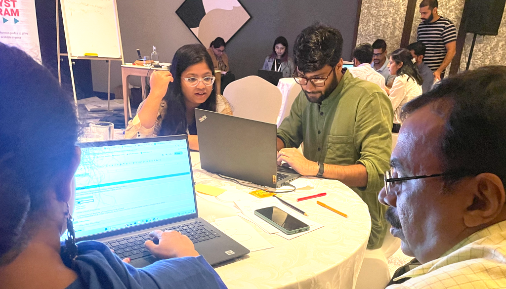
Since this is somewhat complicated, he had designed a highly-interactive and color-coded set of Google Sheets for us to use. The Goalkeep team are masters at this, and participants were able to easily follow the steps of the process and watch the cells in their spreadsheets populate automatically. There were two level 1 problems and one level 2 which kept the room busy until the end of the session.
It was a great start to an excellent two days, filled with learning, collaboration, sharing and a lot of joy.