The right feedback for any product, it is said, does not come from the board room presentations or colorful dashboards, it comes from a direct conversation with the end-user who uses the product.
Ever since Sashakt was battle-tested in the fields of Haryana and Himachal Pradesh through more than 25,000 assessments conducted across 51 districts, we had been eager to immerse ourselves in the field and interact with our users—to understand what they liked, what they struggled with, and what we could do to make Sashakt even better.
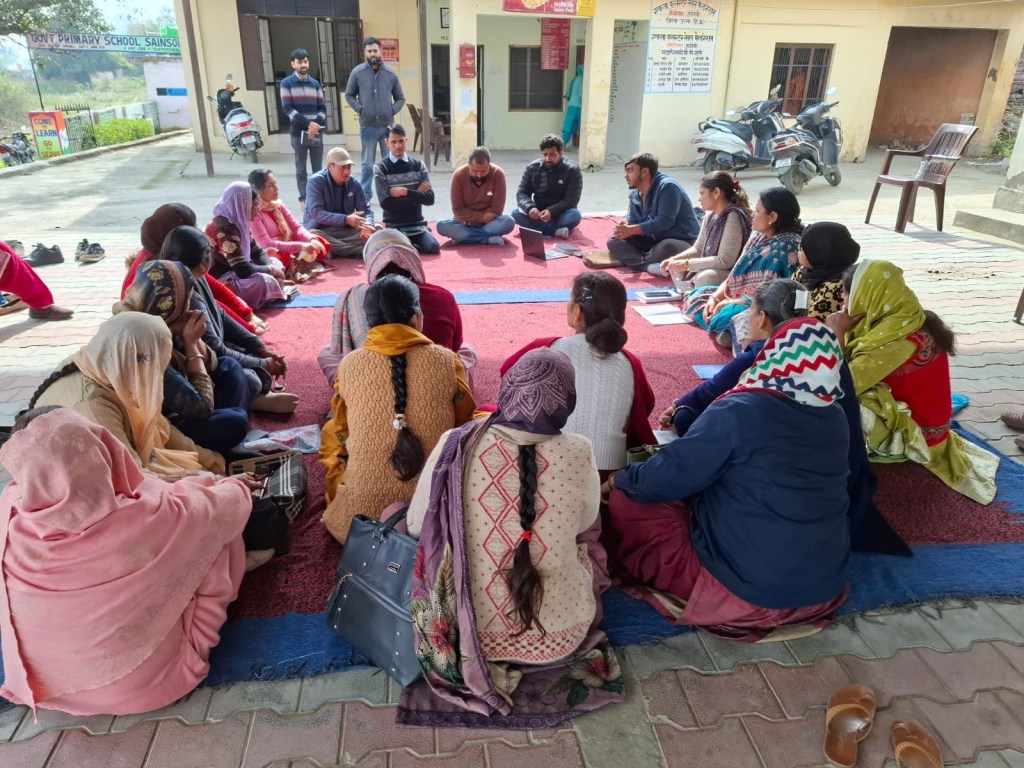
Over the course of a week, our UX research partner, FoldLabs, conducted interviews, observed users in the field, and held discussions with implementing teams and end users. The research uncovered several opportunities to simplify workflows, reduce friction, and make the platform more intuitive.
In this blog, we’ll walk through some of the key improvements that emerged from those findings.
Different Users, Different Screens
One of the strongest themes that emerged from the UX research was that different users have different goals, yet they were all presented with the same interface.
In Sashakt, the admin portal serves multiple types of users. A System Admin is responsible for organization-wide configuration, such as managing tags, templates, users, and other administrative settings. A Test Admin, on the other hand, has a much simpler objective: create and manage assessments.
Showing every administrative option to a Test Admin only added unnecessary complexity. Users had to navigate through menus and settings that were irrelevant to their role, increasing cognitive load and making routine tasks harder than they needed to be.
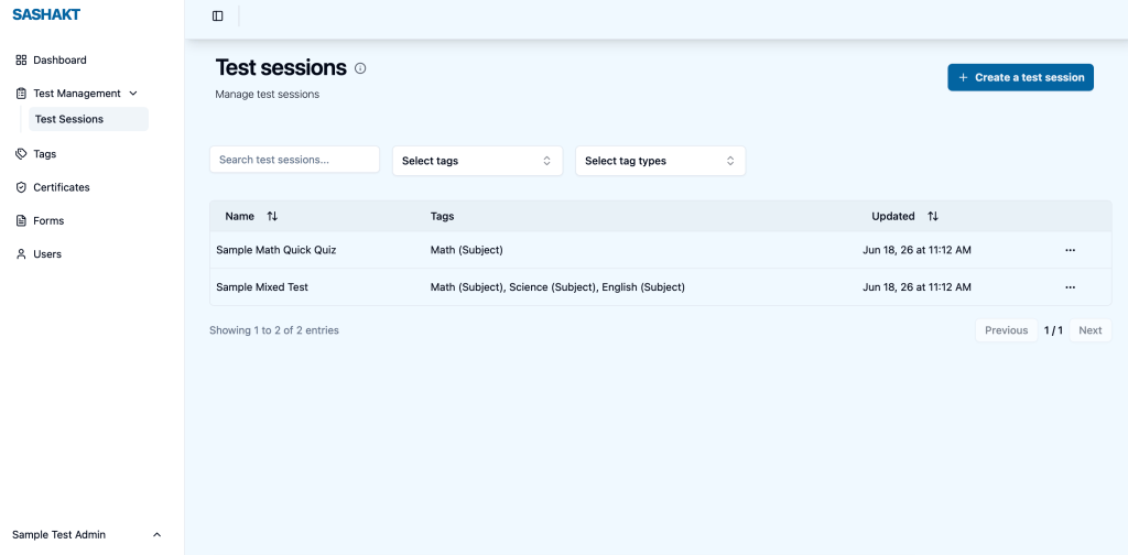
To address this, we redesigned the experience around user roles. The Test Admin interface now focuses on what matters most,creating and managing tests, while organization-level configuration remains available only to System Admins.
Sometimes, the best way to improve a user interface isn’t by adding more features, but by thoughtfully hiding the ones users don’t need.
Reducing Cognitive Load at Every Step
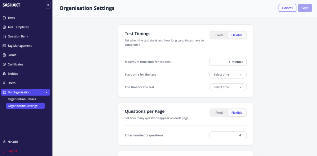
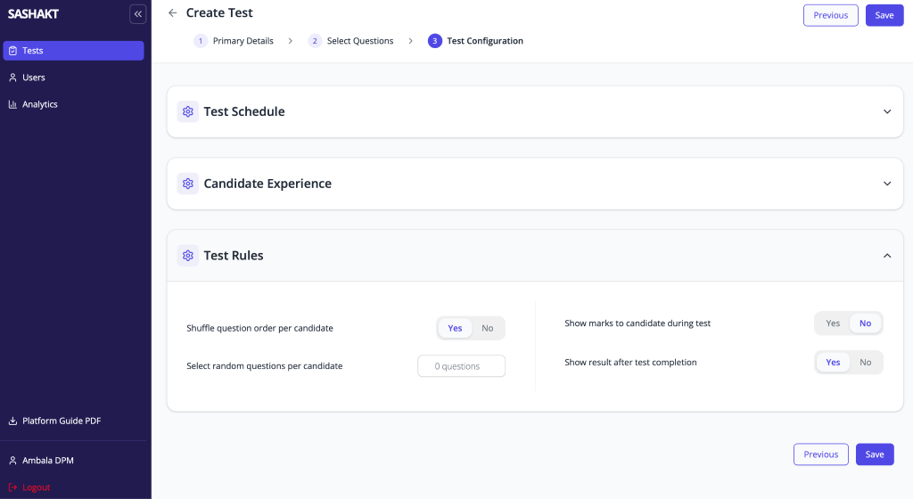
Creating a test in Sashakt involves configuring several settings—pagination size, marking scheme, review options, time limits, and more. During our research, we realized that while these settings are important, most organizations rarely change them from one test to another.
Yet, every time a Test Admin created a new test, they were expected to review and configure all of these options again. This not only made the process longer but also increased the cognitive load, forcing users to think about settings that almost always remained unchanged.
To simplify the experience, we introduced organization-level default configurations. Administrators can now define these settings once, and they are automatically applied to every new test. As a result, Test Admins are presented with a much cleaner interface, allowing them to focus only on the handful of settings that genuinely need to be customized for each assessment.
By moving repetitive decisions out of the test creation workflow, we made creating assessments faster, simpler, and less error-prone.
Creating Guided Paths for Critical Workflows
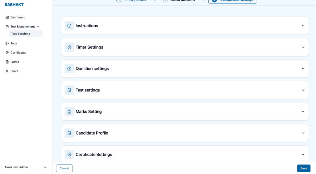
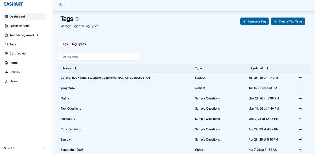
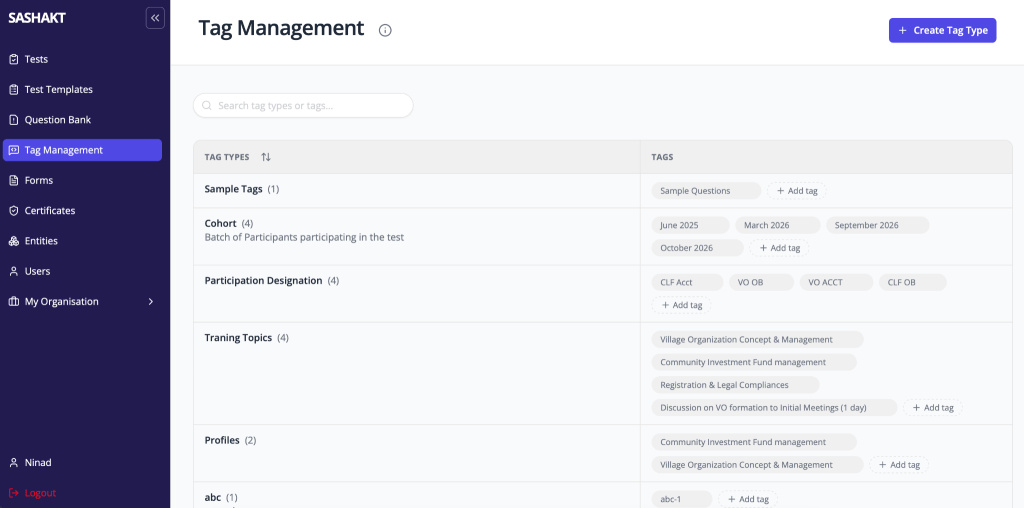
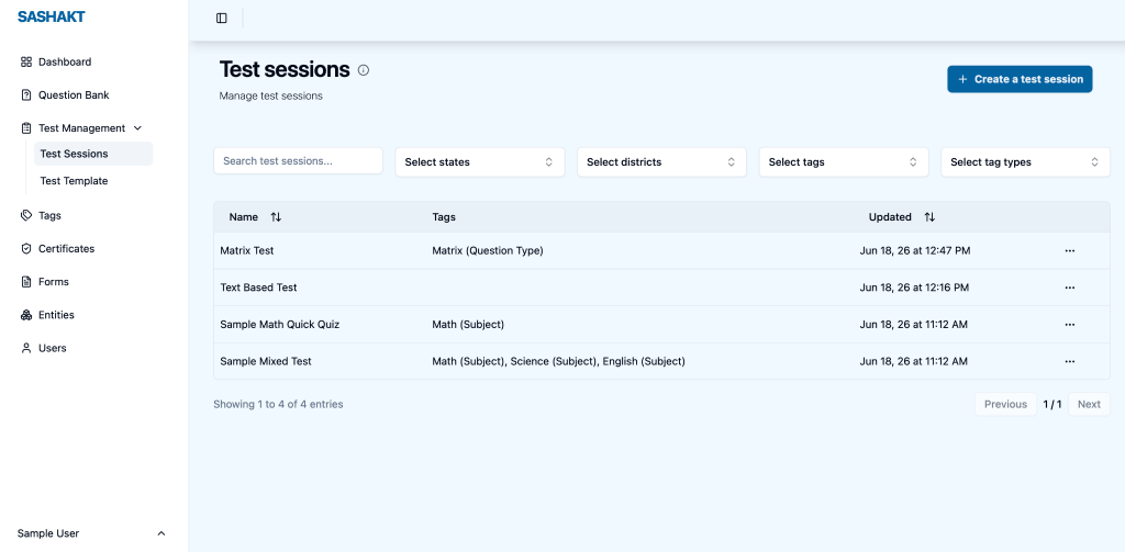
Many workflows in Sashakt are interconnected. Before creating a tag, an administrator must first create a Tag Type. Similarly, creating a new test session often begins by using an existing Test Template rather than starting from scratch.
Previously, the platform assumed that users already understood these relationships. The interface presented all the building blocks, but left it to the user to discover how they fit together. This often led to confusion, especially for users who interacted with the platform infrequently.
Based on the UX research, we redesigned these workflows to make their relationships more intuitive. Tags are now grouped under their respective Tag Types, making the hierarchy immediately visible. Likewise, the Test Sessions page prominently offers the “Create from Template” action, guiding administrators towards the recommended workflow instead of expecting them to infer it.
Good interfaces don’t just provide features, they help users understand how those features work together.
Making Frequently Used Actions Visible
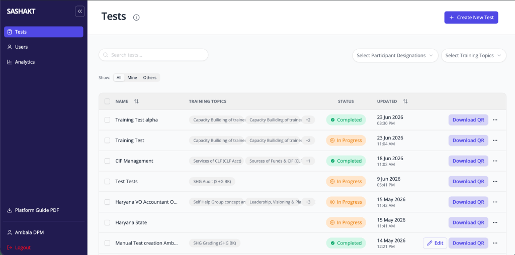
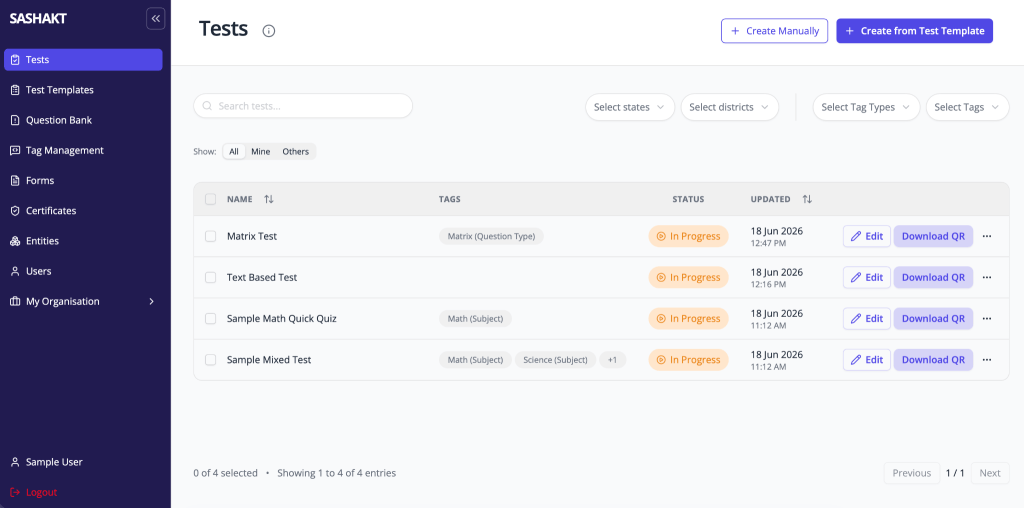
Whether it’s a list of questions, tests, users, or templates, every item comes with a set of actions. Administrators frequently edit questions, download QR codes, duplicate tests, or manage users as part of their everyday workflow.
In the earlier interface, most of these actions were hidden behind a three-dot (meatball) menu. While this kept the interface visually clean, it also meant that users had to repeatedly open the same menu to perform routine tasks. Over time, this small interaction became an unnecessary source of friction.
To improve efficiency, we surfaced the most commonly used actions directly within the list. Users can now access frequently performed operations with a single click, without having to search through an overflow menu each time.
It may seem like a minor UI change, but reducing even a single extra click in a task that is performed dozens of times a day can make the product feel significantly faster and more intuitive.
Making the Candidate’s Journey Simpler
One of the most valuable insights from our field visits came from observing SHG women members as they attempted to take an assessment. What seemed like a straightforward digital journey to us often involved several small but significant hurdles.
Scanning a QR code, noticing the consent checkbox before starting the test, or navigating between questions were not always intuitive. In many cases, Project Associates had to step in and guide candidates through each stage of the process.
Rather than trying to solve everything at once, we focused on removing friction one step at a time.
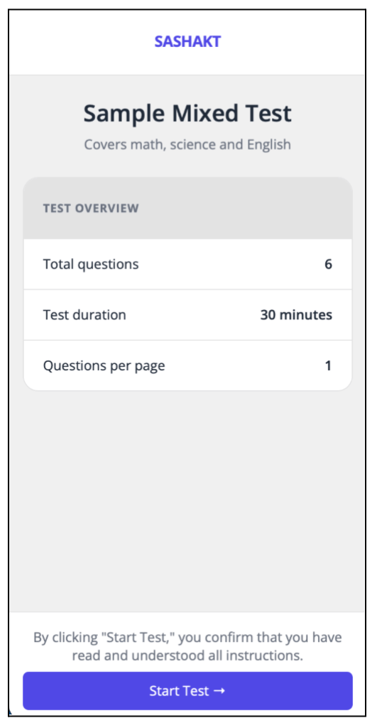
One such improvement was simplifying the consent flow. Previously, candidates had to first select a consent checkbox and then click the Start Test button. We combined these into a single action—clicking Start Test now also records the candidate’s consent. The journey became shorter and more intuitive without compromising the intent of the consent process.
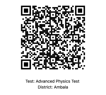
We also redesigned the printed QR code to prominently display the test name and location, making it easier for candidates and facilitators to identify the correct assessment before scanning.
Individually, these changes may appear small. Collectively, however, they reduce confusion, minimize the need for facilitator intervention, and make it easier for candidates to begin their assessments with confidence.
Because in the end, a good user experience isn’t measured by how many features a platform offers—it’s measured by how effortlessly people can accomplish their task.

These are just a few of the many improvements that have gone into Sashakt 2.0. Each of these changes is rooted in observations from real users and reflects our effort to make the platform simpler, more intuitive, and easier to use.
If you’re interested in learning more about the research that informed these design decisions, you can read the detailed UX research report and design recommendations here.